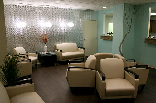
My uncle asked me to help him with some interior design work for his new office, Chau Plastic Surgery. He's an amazing plastic surgeon in Berkley, MI (near Detroit). I'm quite in awe of what he's gone through and his accomplishments. At the age of 16, during the Fall of Saigon, he boarded a helicopter at the US Embassy in Vietnam to flee the country. He was alone and perhaps did the hardest thing anyone had to do at any age. When he arrived in the US he faced many years of discrimination and racism. He washed dishes to pay his way through college. He eventually ended up in medical school and became a surgeon. He's never forgotten where he comes from, although at times I feel he's haunted by his past. Success is a hard thing to grasp, he still peers over the fence to see how green the grass is on the other side. If he reads this I'd like him to know he's standing on a lush meadow of green, there's no better place than the one you've built for yourself. We're all very proud of him.
More about Dr. Bruce Chau
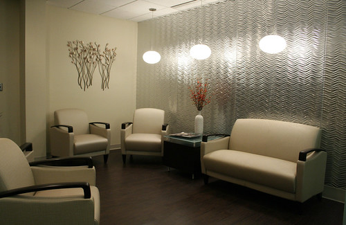
I picked the color palate and did a concept sketch for him. I wasn't involved in any of the construction process. He had the help of many friends and staff members. Thank you guys, I'm sure you held it together for him.
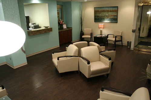
They wanted a calming and welcoming feel. When I left everyone was very happy with this new space. It was great to meet you all: Ashley, Maria, Amy and Allison(?)... also Dr. Barak! Good luck with everything.

Another shot of the room.
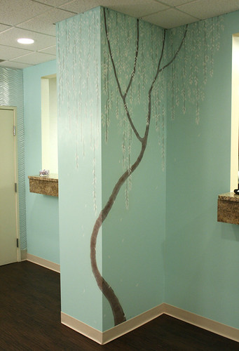
I painted a tree mural in the center of the room. There was a column that juts out and we wanted to make it more of a feature and less of an intrusion.
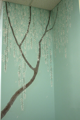
Close up of tree mural.
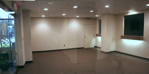
Before:
This is the space before any construction.
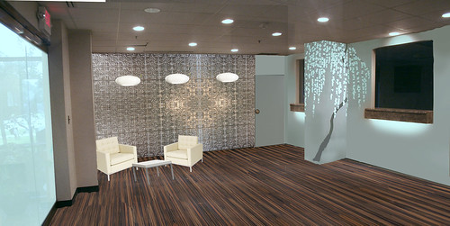
After/Concept Sketch:
There's more furniture in the room... but I thought I did a good job of outlining the design elements. They still need to frost a huge wall of windows.
love that tree...
ReplyDeleteMan, you snazzed that place UP! The concept sketch did a really good job of showing what it would turn out to be. I love the tree. And that blue is beautiful -we are going to paint our nasty bathroom soon and I think I want to rip off that color - do you know what it is exactly? It looks great!
ReplyDeleteThank you Deanna :)
ReplyDeleteKamala- you know I forgot what color that is exactly... I believe it was a Valspar color. I'll go ask. It looks blue in day light or brighter lighting and green in dimmer lighting. I'm so going to paint on my walls now :)